Werbung: Alle Markennennungen sind unbezahlte Werbung, Marken werden nur aus rein Informativen Zwecken genannt, es bestehen keinerlei
Verträge oder Verpflichtungen mit den genannten Marken!
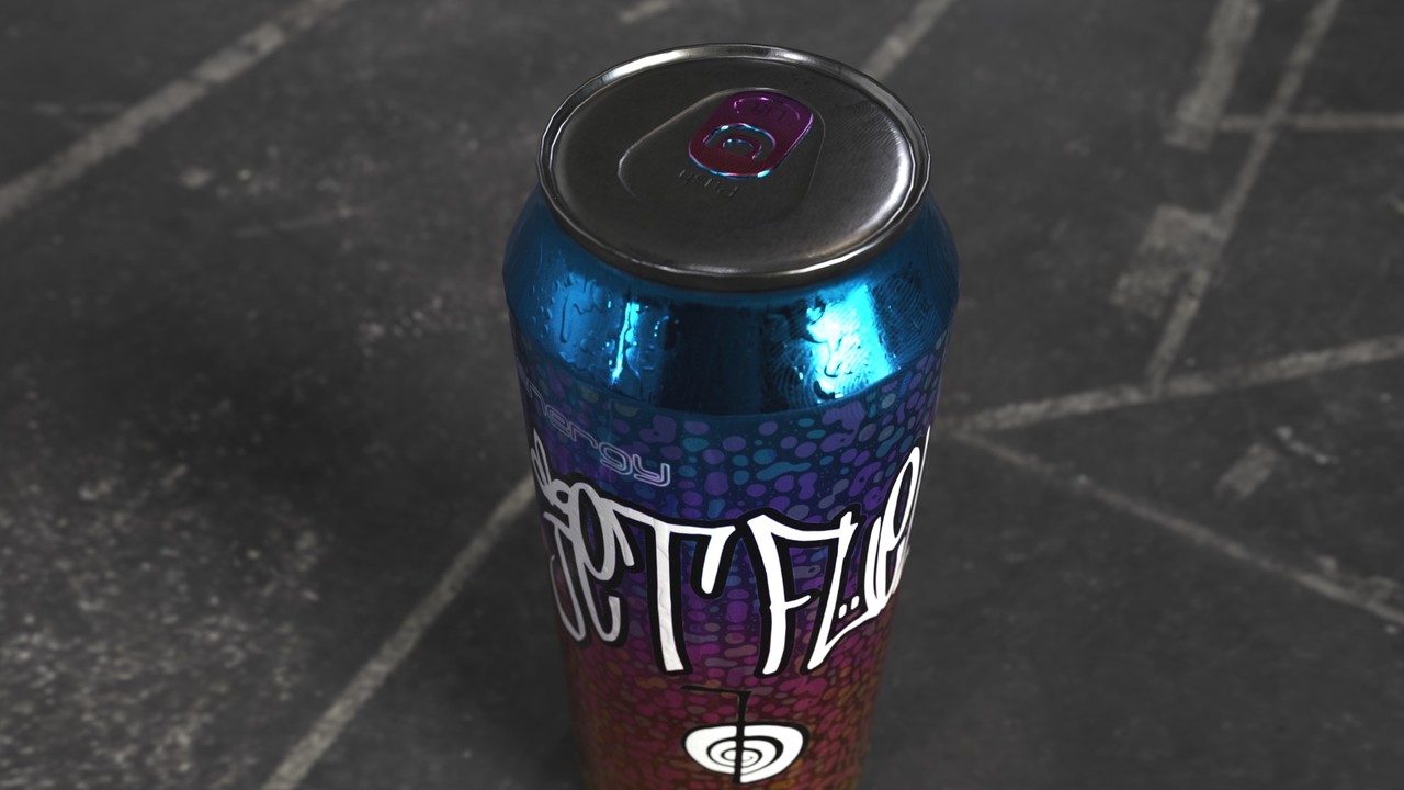
Can by Dark Minaz licensed under CC Attribution-ShareAlike.
hello,
I am not a product designer and not any good at 2D-logo art (both would have been very handy for this project hehehe)
- so I tried to focus on the can's paint-job and fx (like water drops, fingerprints, car-paint-like look and so on)
But first things first - I had to find a foundation-base for the can. I went with a brushed-aluminum type of material , very common and found on many cans (and also in the painter library)
Because I don't wanted to go with a "chipped away", beaten up look, I did not apply any other "primers" or something like that.
Later on, the brushed aluminum will be fully visible at the top and bottom of the can - for the rest of it, only the small
brushed pattern will augment the surface.
Ok - base was ready - what now?
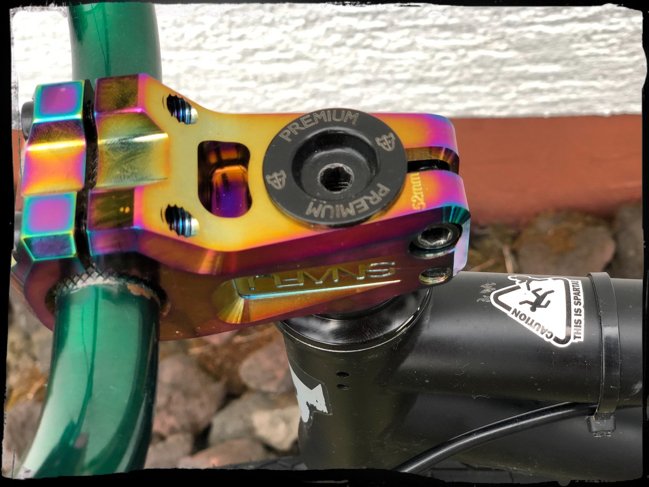
In the past, I build up a BMX bike (was really fun) and I came across some relatively new color: "JetFuel" (sometimes
also referred as "oil slick") Technically , it's not a color or painted in common ways - this is achieved by a special heat treatment to the metal.
For reference:
I was super glad, to find exactly such a material on the Substance Source library - yeah! After a bit of tweaking, the can got it's 2nd Layer.
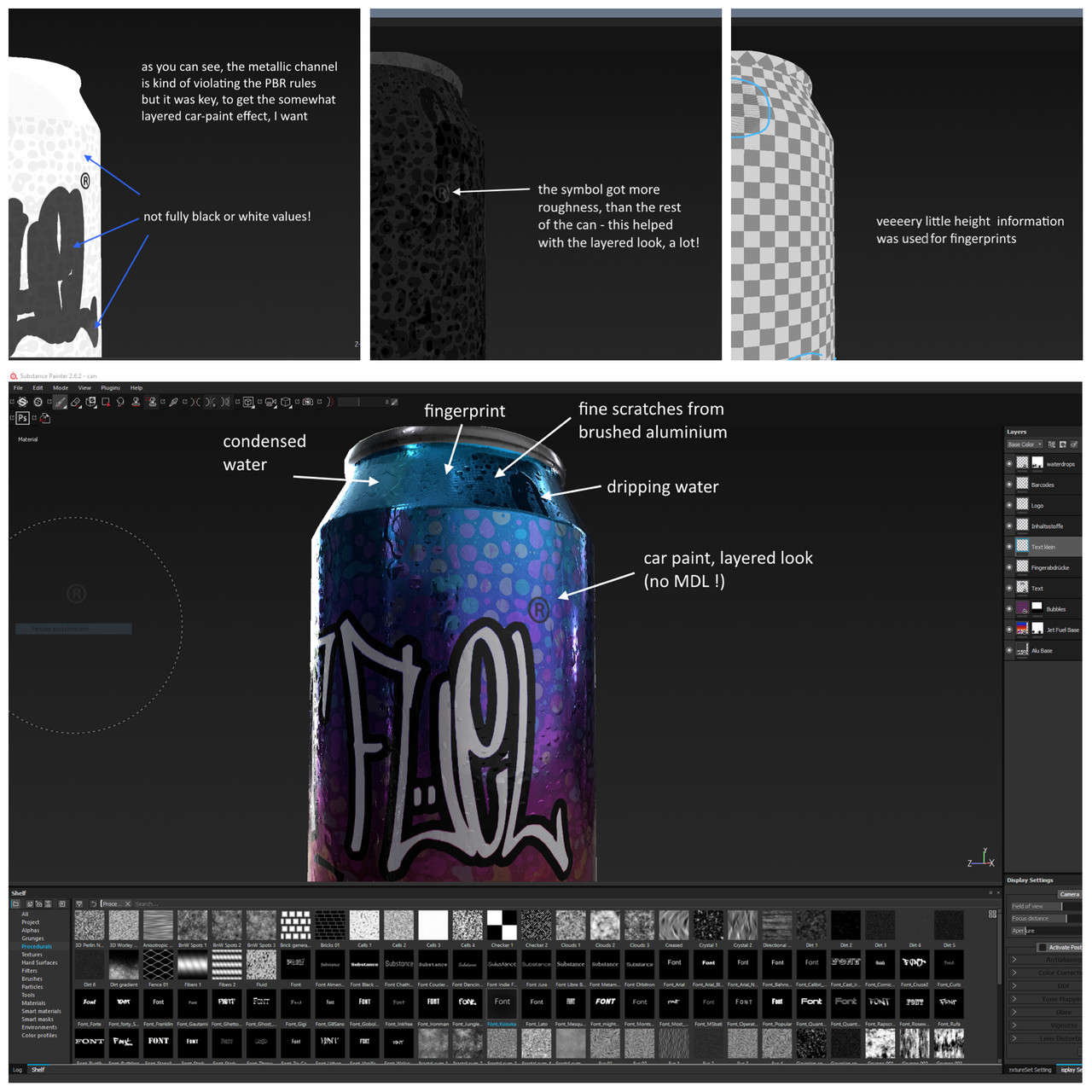
Now, I decided to go a bit crazy (for the "bubbles" version) and put on another (very strange looking) material - magnetic fluid.
But for this one, I only used the metal and roughness information and tweaked the values until they blended into the jet fuel
material, like I wanted it to. The thing was, not to go rather full metal or non-metal with it (even if this will violate the
laws of PBR). However, this violation turned out to work very well towards the look, I was after.
Time has come, to design some kind of logo (the hardest part for me)
My Idea was, to find something that stands for "power" and also resembles a turbine or a rocket.
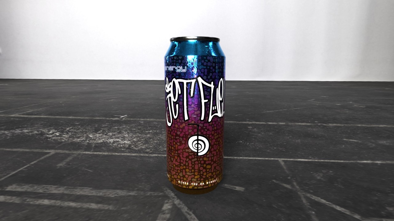
After some research, I've found out about a "Reiki" symbol. It stands for "power" - and the swirl of it reminds of a turbine!
So i decided to pair it with the name of my fictive drink "Jet Fuel" to have something like a brand or logo on my can.
One side of the can was now kind of alive - but the other side - not.
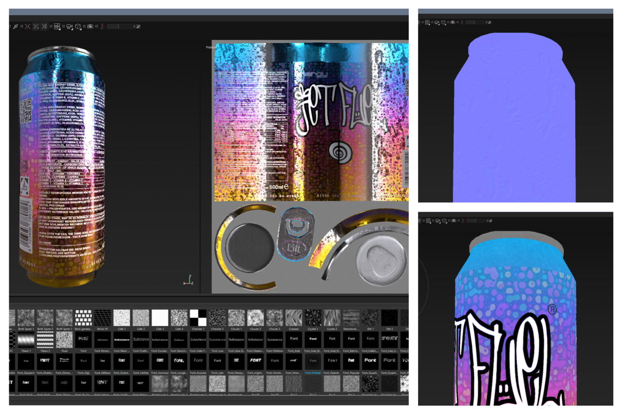
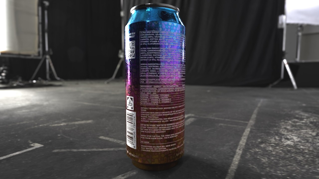
The next part took me quiet a while to finish: Nutrition Information, Barcode, QR Code, Symbols!
Oh my lord! I went with real world reference (in fact, the empty energy drinks in front of me) to get this done.
Ok - I broke with the reference here and there, regarding the Informations ;)
It was time to finish this asset with some final "touches" - literally! I put on some fingerprints here and there (painter alpha) and tweaked channels a lot. I decided, to go with miiinimal height and metal information only.
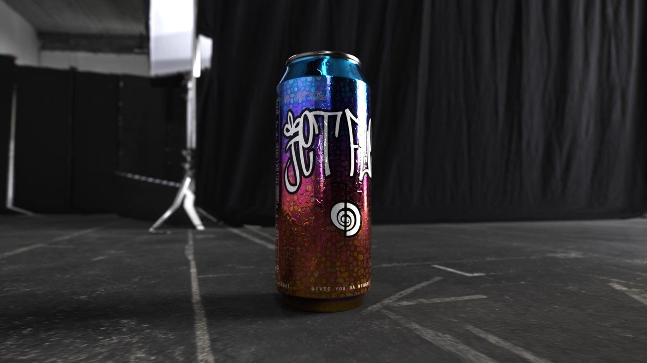
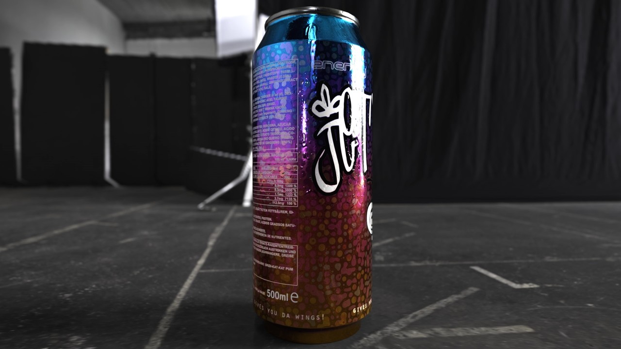
Because it's summer and cool, refreshing drinks are always welcome, I coated the can with some ice-cold condensed water.
For this one, only some channels were used, as well. Again, carefully tweaking and eyeballing was needed, to get the overall result, I was
going for.
Substance Painter´s Viewport yields some nice results already
Another result of the setup was, the level of water condensation is tied to the camera and lighting!
So the can's surface can look more or less chilled, aka more or less water is condensed or already run down.
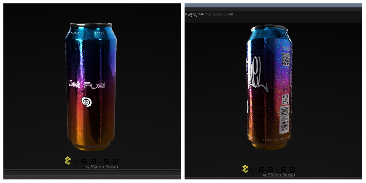
Now some iRay Render shots - enjoy!
Links to sketchfab: clean version and crazy bubble version
That's it for now - I hope, you've found it helpful and informative. Please leave a comment, if you feel like it.
Thanks for reading,
Karsten

